Anti-colorization to Improve Older Images
In recent years, a number of classic black & white movies have been “colorized” into new pseudo-color movies. A controversial practice, colorization has succeeded in transforming the mood of the older movies by emphasizing some qualities and de-emphasizing other qualities (whether for good or bad is a different debate). Still images have been colorized (“hand colored”) for many years with Marshall’s Oils, enabling the artist to select which shades of gray should be mapped to various colors. The opposite process can be equally powerful in transforming the mood of a color image into a black & white image.
Earlier this year, we presented an article encouraging experimentation with black & white. The aim of that article was to get you to think about how a black & white image might be stronger than a color image (and, hopefully, to realize that potential at the time you capture the image), and concluded with some advice to consider how black & white may enhance some of your previously-shot, ho-hum color images. This week, we follow our own advice, selecting a color image from our ‘B’ list and seeing what what can be done through digital manipulation of the color-to-grayscale mappings to transform the image into something more provocative.
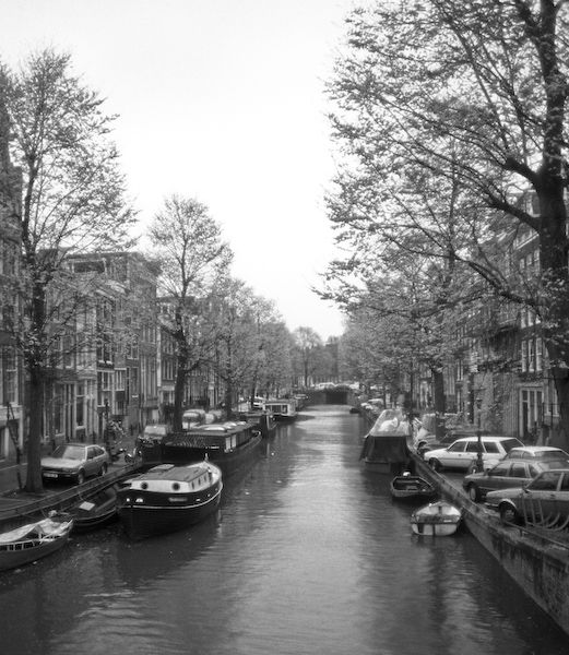
It was May in Amsterdam and there was a lot of green in almost every direction. The trees were leafing-out, the canal was lined with green algae and moss, and even the water was an opaque green. The cloudy sky created a flat lighting that compressed the tonal and color ranges, and seemed to subdue anything that was not green. Don’t get me wrong — I do like green! Had I been using a Fuji film such as Velvia, I might have had some interesting separation in the greens, but the Agfa film I used tended to cast a warm tone over the entire image and further muddy the greens in the process. All in all, the color slide was not particularly compelling for me, and stayed in a box (out of view) for many years.
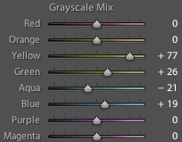
The process began by digitizing a color slide. I used a dedicated film scanner, but many of today’s flatbed scanners are capable of doing an admirable job of digitizing slides. Once the image was in the digital realm, I brought it into Adobe Lightroom, and concentrated on the “Grayscale Mix” controls. By adjusting the sliders corresponding to various colors, I was able to easily explore the range of possibilities and create a filter that produced the desired separation of greens and set the overall mood. (See the screen capture, super-imposed on the above image, showing the settings on the sliders.) The resulting image transports me to that spot on the bridge over the canal, and does so more strongly than the original slide.
I have always felt that black & white is a different medium from color. “Seeing” in black & white changes what we perceive as important vs. distracting, and impacts how we compose, crop, and scale our images. As a fun (and hopefully rewarding) exercise, review some of your color images, ask yourself the questions “What is it that I was hoping to say when I first captured the image?” and “How can I eliminate everything else?”, and then start exploring what can be done with anti-colorization to improve the strength of your images. You may find, as I have, that with many of our older, less-than-successful color images, we have all the necessary ingredients for a fine black & white image.

Tip of the Week
2007.08.20


